
Windows 8.1: My Opinion Elaborated
[Page 2] Part 2
The Straw that Broke the Camel's Back
Back to the question I posed earlier, namely what prompted me to suddenly blurt out a rather indelicate criticism of Windows 8 on the front page of my site. The answer is that it was my hands-on experience installing and using the recently leaked finalized version (RTM) of Windows 8.1. That was combined with reading various articles and comments about Windows 8, and 8.1, on the Internet. I was frustrated, disappointed, and angry.
My disappointment came from the fact that I thought Windows 8.1 would be Microsoft's way of listening to valid complaints, and rectifying them. Much the same as they had done with Windows Vista - they listened to the most sensible portions of user feedback, and refined Vista to wind up with one of the most popular versions of Windows to date: Windows 7. I can assure you that this is not what has happened with Windows 8.1. Indeed, I would argue that quite the opposite has occurred, and I'll demonstrate this point with some practical examples shortly.
My frustration was the result of seeing what I consider a dumbing down of the Windows desktop experience via Windows 8, with a confused and confusing interface that frequently fights against what you would naturally want to do, for no other reason than to force you into the Metro environment as often as possible. This is only made worse, not better, by Windows 8.1.
My anger stems from reading page after page of remarks from supposedly expert and inexpert commentators alike, defending the changes in Windows 8 as somehow being "more efficient", and essentially referring to people as luddites for not accepting them.
I felt it was finally time to speak out about the whole debacle, and offer up my own opinion.
So What's the Big Deal About Windows 8.1?
Taking off my tech enthusiast's hat for a moment, I can empathize with readers who must be wondering why the hell so much fury has been directed at Windows 8/8.1. "Surely", they must think to themselves, "people who don't like Windows 8 can just stick with Windows 7." This thought is probably followed by something along the lines of "There can't be that many changes in Windows 8.1, can there? And if there are, they can't be that bad. What's the big deal?"
On the face of it, I would have to agree with both of those statements. Microsoft isn't holding a gun to anyone's head, forcing them to switch to Windows 8. Windows 8.1 is another matter of course; if you're already using Windows 8, the OS will continually nag you to install it as an important update, and I suspect at some point it will become a required update, if only for security purposes. But more importantly, people buying new PCs, particularly laptops, will find that they have Windows 8 or 8.1 pre-installed, which means they face additional effort and cost if they want to revert back to Windows 7.
It's also true to say that Windows 8.1 doesn't radically change Windows 8. I can't provide a detailed rundown of all of the changes in Windows 8.1 here, as that would require several pages, but the most obvious changes can be summarized as follows:
Reading that list, you might still be scratching your head as to why I'm making such a fuss over Windows 8.1. Don't almost all of these things improve Windows 8? I suppose they do, if looked at in abstract, devoid of how and why they've been implemented, as well as many of the changes that are not necessarily as headline-worthy, but certainly worth closer examination. As with most things in life, the devil is in the details.
The fundamental issue I have with Windows 8.1 is the stepping up of a very noticeable agenda by Microsoft to push its Metro interface, and associated services, such as SkyDrive and Microsoft Accounts, onto unsuspecting users, irrespective of whether this is the best choice for an individual user's needs, irrespective of potential privacy or security risks, and of course, with little concern for users on more powerful desktop PCs.
As noted in the introduction, I've been using Microsoft operating systems since the MS-DOS days way back in 1988, and this is honestly the first time I've seen Microsoft so blatantly disregard its customers' welfare through options that border on outright deception, or by removing or hiding features, just to push the Metro interface which they hope will create a better revenue source for them. But accusations are easy to make, so let's look at some practical examples that back up what I'm trying to say.
Choice is Bad?
Henry Ford, founder of the Ford Motor Company and father of the modern mass-produced car, famously said: "Any customer can have a car painted any color that he wants so long as it is black." Obviously, this philosophy never caught on in the marketplace, otherwise we'd all be driving identically colored cars by now. However, there is some wisdom to the concept that too much choice can be just as bad as too little choice. Even though I run a site called TweakGuides, which promotes the notion of greater customization ("tweaking") of software, in my observations, there's usually a happy medium at which there are sufficient options for necessary customization, without it becoming a confusing and overwhelming experience for the average user.
With Windows 8, and now 8.1, Microsoft clearly holds fast to Henry Ford's views. The removal of the Start Menu is the best-known example of the Windows 8 philosophy, which is to deliberately reduce customer choice so as to steer them towards Metro, whether they want it or not.
To this day, I still see people arguing on forums and in comments spread across a variety of sites, even in articles by professional tech authors, that the Metro-based Start Screen is more efficient than the old Start Menu. I can't resolve this debate once and for all, but I can say that this is utterly and completely untrue in my own case. I provide a simple example below. My task involves uploading an image to my server, after some basic editing of it in Windows Paint:
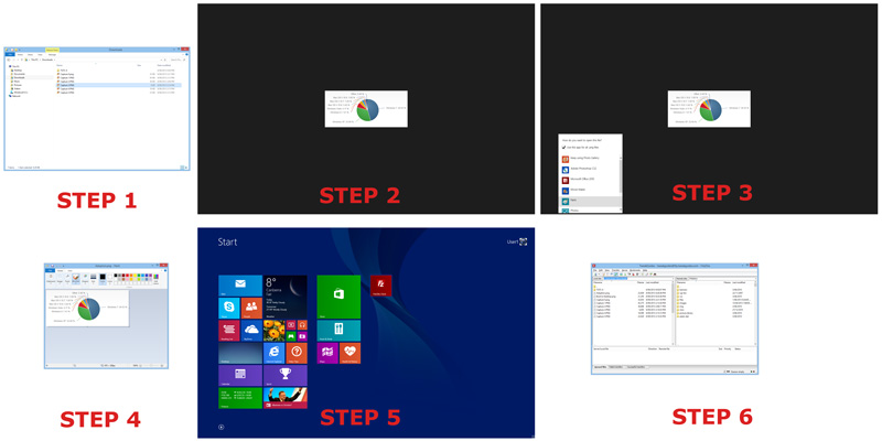
Metro-based Method
First up, we'll complete this task in Windows 8, with default settings, as illustrated in the screenshot above, and explained in the text below, along with the minimum number of mouse button clicks required for each step:
Step 1. Click the default Folder icon in the Taskbar to open File Explorer, and navigate to the directory with the image file. Let's assume the file resides in the base directory in which I opened File Explorer. Result: 1 left-click.
Step 2. Double-click on the image file to view it, to ensure it is the correct image I want to edit. The default Metro-based Photos app opens. There are editing options here that have been added as of Windows 8.1, but not enough to do what I want. Result: 1 double-click.
Step 3. Right-click on the image, select the 'Open With' option that appears in the App Bar at the bottom of the screen, then select Paint from the list that appears. Result: 1 right-lick, 2 left-clicks.
Step 4. Windows Paint opens back on the Desktop, and I complete my editing of the image and save it.
Step 5. I want to launch the Filezilla third party FTP utility so I can upload this newly edited image file to my server. To do this, I need to click Start and type Filezilla on the Start Screen; or right-click Start, select Search, and type Filezilla; or go to the top right corner, select the Search charm and type Filezilla; or if I have Filezilla already pinned on my Start Screen (as in this example), click Start and select the Filezilla tile. Result: at a minimum, 2 left-clicks.
Step 6. Filezilla opens on the Desktop and I upload my image.
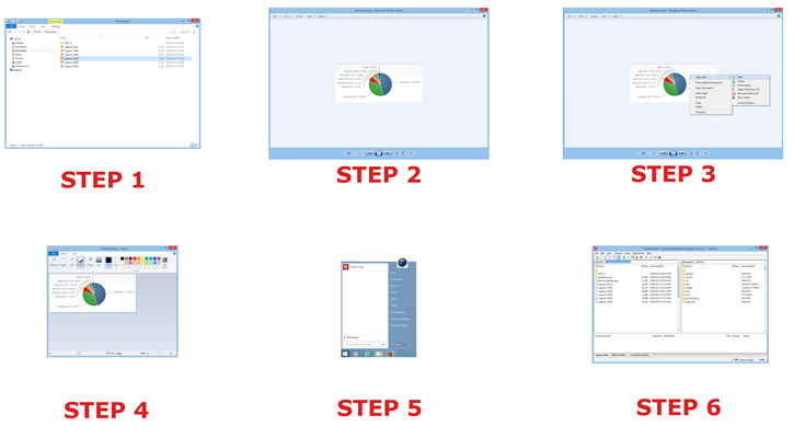
Start Menu Method
In the second instance, as shown in the screenshot above, I use the traditional Start Menu, courtesy of the Start8 third party Start Menu replacement utility, and a single setting change: altering my default photo viewer from the Metro-based Photos app to the Desktop-based built-in Windows Photo Viewer:
Step 1. Click the default Folder icon in the Taskbar to open File Explorer, and navigate to the directory with the image file. Let's assume the file resides in the base directory in which I opened File Explorer. Result: 1 left-click.
Step 2. Double-click on the image file to view it, to ensure it is the correct image I want to edit. The Windows Photo Viewer opens on the Desktop. Result: 1 double-click.
Step 3. Right-click on the image, select 'Open With' and select Paint from the context menu that appears. Result: 1 right-click, 1 left-click.
Step 4. Windows Paint opens on the Desktop, and I complete my editing of the image and save it.
Step 5. I want to launch the Filezilla FTP utility so I can upload this newly edited image file to my server. To do this, I need to click Start and type Filezilla on the Start Menu Search Box; or simply select the Filezilla icon already in my Start Menu. Result: at a minimum, 2 left-clicks.
Step 6. Filezilla opens on the Desktop and I upload my image.
The very first thing you might notice when comparing the screenshots above is how the Start Menu method provides a consistent interface appearance, while the Metro method involves shifting back and forth between windowed desktop programs and full-screen Metro interfaces.
In terms of efficiency, the net result in mouse clicks is as follows, not counting the various mouse clicks for Steps 4 and 6, as they're identical in both methods.
Metro-based Method: 5 left-clicks, 1 right-click, and 1 double-click.
Start Menu method: 4 left-clicks, 1 right-click, and 1 double-click.
The Start Menu method uses one left-click less than by the default Metro method. Now understandly, some people might say: "But you don't need to left-click to access the Start Screen, you can press the WINDOWS key!" (the same is true for the traditional Start Menu), or "I would use keyboard shortcuts to get things done much quicker than that!". The reality is that there may be a dozen different ways to do what I've described above, using the Command Line or macros, or Desktop icons or third party utilities. But the above scenario is a realistic, and not unnecessarily padded out, comparison of the method most any average user would probably be familiar with. This quick comparison shows that using the Metro method is definitely not more efficient in this instance. But the numbers don't tell the whole story. Using the Metro method actually involves much larger mouse movements, as the distances between each click is larger. And again, as the screenshot comparison demonstrates, there is a noticeably different interface flow between each step of the Metro method, shunting you between windowed Desktop and fullscreen Metro, which I personally find an unpleasantly disjointed experience.
Ultimately, whether you prefer one method over another is largely a subjective choice based on your own tastes, there is no right or wrong. However, whether using the Metro-based Start Screen and Metro Apps method is objectively more efficient than using the traditional Start Menu and Desktop-based windowed programs method, which is a common argument, the answer in this case is a resounding No. Which provides strong backing for the need for more choice in Windows 8.1, so that people who don't want to deal with the constant jump from Metro to Desktop and back, can do so, without being forced into accomplishing something in a potentially less efficient and annoying manner, or having to resort to third party alternatives.
What did Microsoft do when faced with numerous complaints regarding the Start Menu? Their answer, found in Windows 8.1, is to add back a Start Button. But that's all it is, just a button. It doesn't launch a Start Menu, which is what the complaints were really about. When clicked, it just takes you to the Metro Start Screen, which is precisely the same thing Windows 8 did when you clicked in the same (blank) area of the Taskbar. Except now, there's a Start Button, which can't be disabled through any built-in Windows options, annoying the people who liked the minimalist Start Button-free Desktop prior to Windows 8.1. This basic change is symptomatic of Microsoft's loss of direction, failing to accommodate both customer groups in a single swoop.
The correct move would have been to return the Start Menu in Windows 8.1, in recognition of the very large number of PC users who don't have touch screens, and who don't want to use Metro. Data from back in May 2013 in this article shows that within the first 6 months of Windows 8's release, there were already at least 8 million users, out of a potential maximum of 100 million Windows 8 users, that were using the Start8 or Pokki Start Menu replacement utilities. Given there are several other, quite popular Start Menu replacement utilities, like Classic Shell and StartisBack, it's quite likely that figure of 8 million substantially understates the true proportion of people who can't do without the Start Menu. Again, all for want of a simple option to return a feature that existed in previous versions of Windows, but which Microsoft no longer deems to be in line with their mobile device strategy of forcing Metro upon all Windows 8 users.
We look at some more examples on the next page.
|
|